TELUS Billing Redesign
Role: Design Lead
Billing has always been a thorn in any major telecommunication company’s side. Customers are rarely happy when paying for their phone plan, especially when many aren’t very transparent about what they are being charged for. This is where usability and empathy step in. My team and I were tasked with redesigning the TELUS app’s current billing system to make it both clearer and friendlier for customers.
The Problem
- The TELUS customer support team had flagged that a significant number of their calls came from people complaining about their bill.
- Calls about billing had two major use-cases: 1) First-time customers wondering why their bill was higher than they expected. 2) Long time customers going over their limit, but still not understanding why their bill was higher or how they went over.
- Through this, we hypothesized that there were two pieces missing from the current experience; one being first bill education and the second being information hierarchy.
Hypothesis Validation
- Our first order of operation to a solution was to validate our thinking with real customers. We partnered with a local TELUS store to gather feedback from customers regarding their bill. We both sat down with real customers and did ad-hoc analysis of real bills.
- From our analysis of customer interviews we were able to validate and draw conclusive evidence that our hypothesis was correct.
- We were also able to draw a mental model of how customers react to bills as well as how they read / understand them based on user interviews.
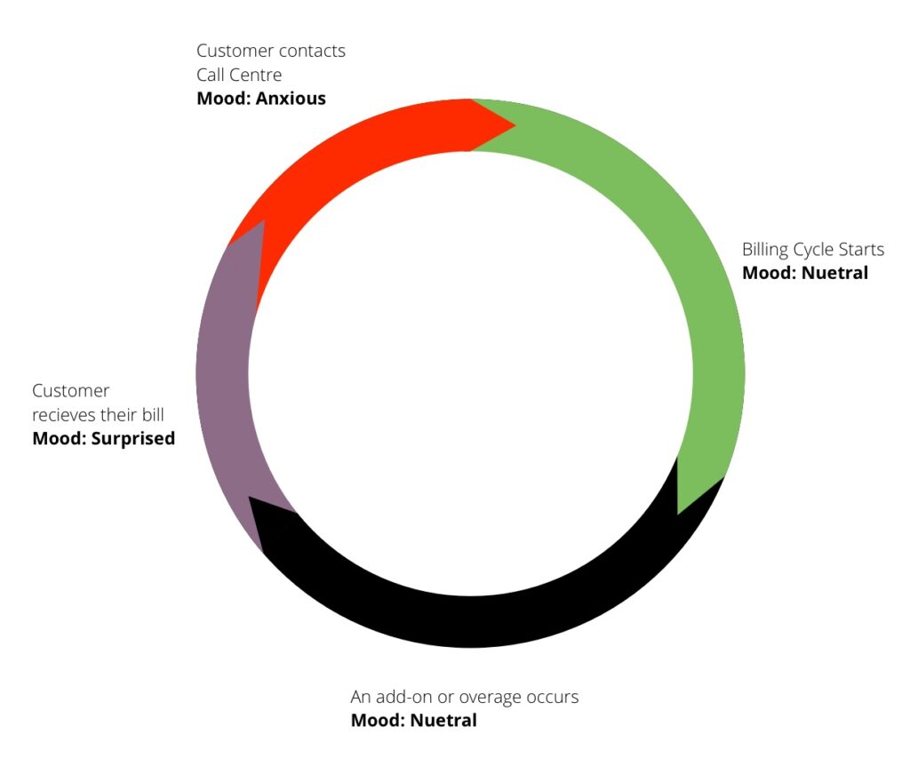
- We found that customers had a cycle of believing everything is okay with their usage, even buying add-ons until they received their bill.
- We referred to this as the “Oh snap!” cycle, where customers would forget about the actions they took that gave them a larger than expected bill.
- Research also found that customer’s mental models were fairly consistent. They divided their bill into three parts: Base Plan (What they signed up for), Other Charges (Anything more than their base) and Taxes.
- For the first time bill education, there were two elements that customers misunderstood; Proration and Overage charges.
Old Design
- The old design was very basic as it just listed out line-items in the bill divided by who incurred the charge.
- There was also no first-time bill education.
- From customer testing and research, we realized that this was not reflective of the customer mental model.

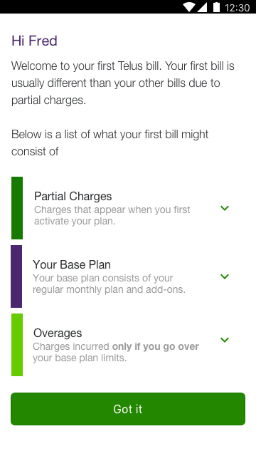
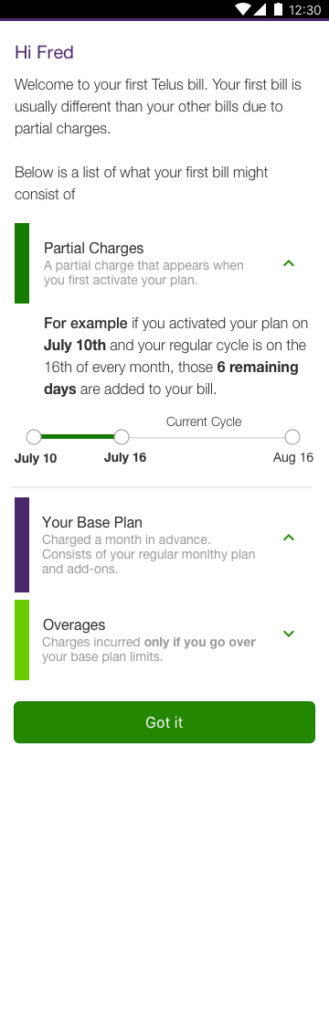
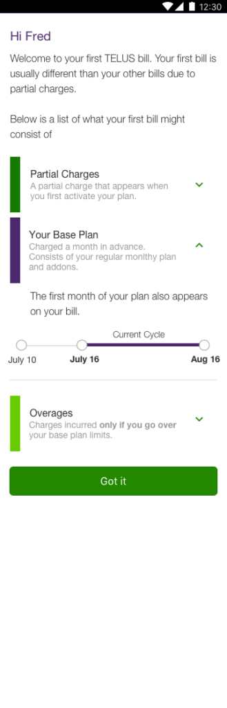
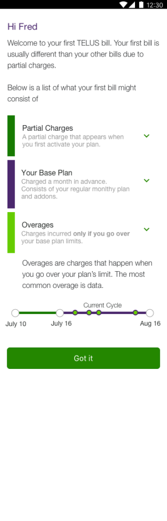
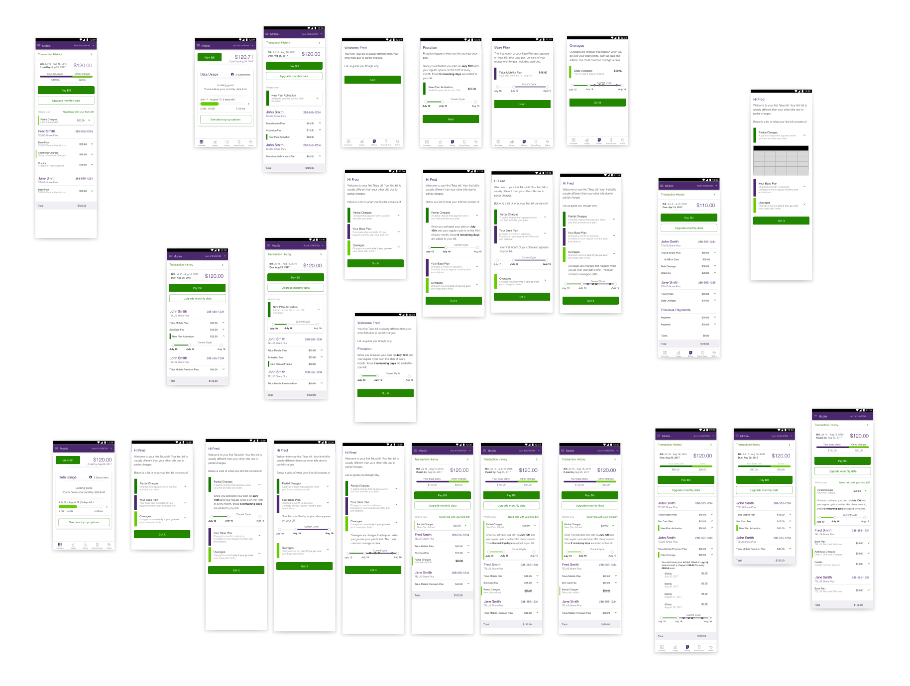
First Time Bill Education
Using research results, we designed a solution that covered the three main charges that customers may see on their new bill.
- Partial Charges
- Charges that carry over from when the customer activates to the end of their billing cycle.
- This was confusing to customers as they don’t understand that their plan activation date may not coincide with their monthly bill cycle.
- Base Plan
- Charges based on the plan they have chosen.
- This does not change from month to month.
- Overage
- Sometimes going over plan limits can happen even with the customer’s first bill. We decided it was a good idea to prepare them for that.
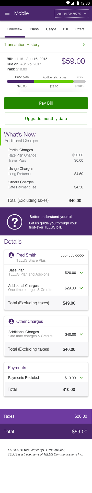
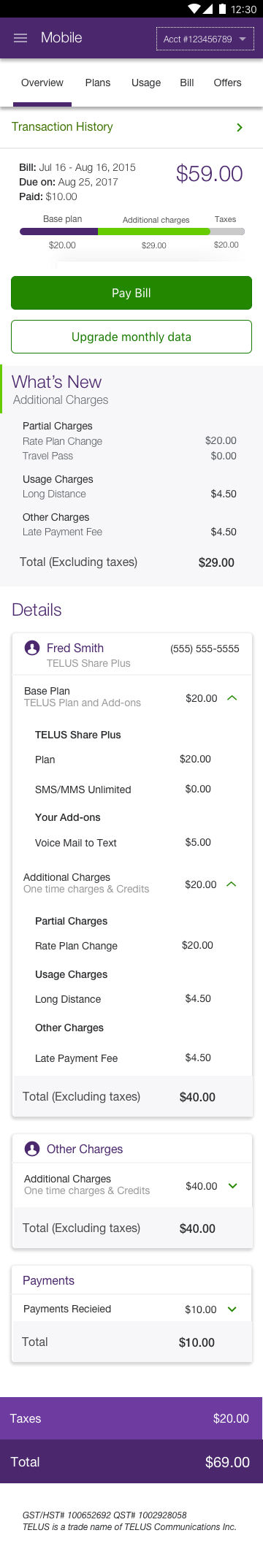
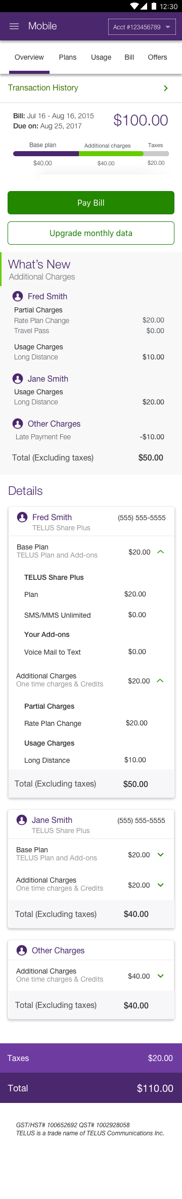
Billing Breakdown
- Breaking down the bill was a harder task than the educational piece. Through multiple iterations and testing, we realized that the main pain-point was the informational hierarchy.
- Customers did not know what they usually are paying for versus what was extra. The only point of reference they had was the dollar amount on their bill.
- With this in mind, we came up with a definitive hierarchy.
- [Bill Dollar Amount]
- This was a base-level breakdown of the customer’s bill. it included the dollar amount owed and visualization which clearly outlines what is part of the customer’s base-plan vs their additional charges.
- [What’s New]
- This lists out the additional charges for customers
- Helps customers understand any extra charges.
- [Details]
- A full list of charges for each customer.
- This hierarchy also helped with scan-ability of the bill. Where if the customer was okay with the Bill Dollar Amount section, they could just pay right away.
- As opposed to if they had an unexpected amount, they could just scroll down to know exactly why in the What’s New section.
User Testing
- User testing both with our in-store partner and through user interviews, we proved that the current redesign and educational pieces were effective.
- It took a couple of iterations to explain proration, due to its date specific and complex nature.
Outcomes
- A month after the initial release app reviews were overall positive, with very positive comments about the easy to understand billing. Telus’ star rating also increased.