Scotiabank Digital Styleguide
Role: User Experience and IA Contributor
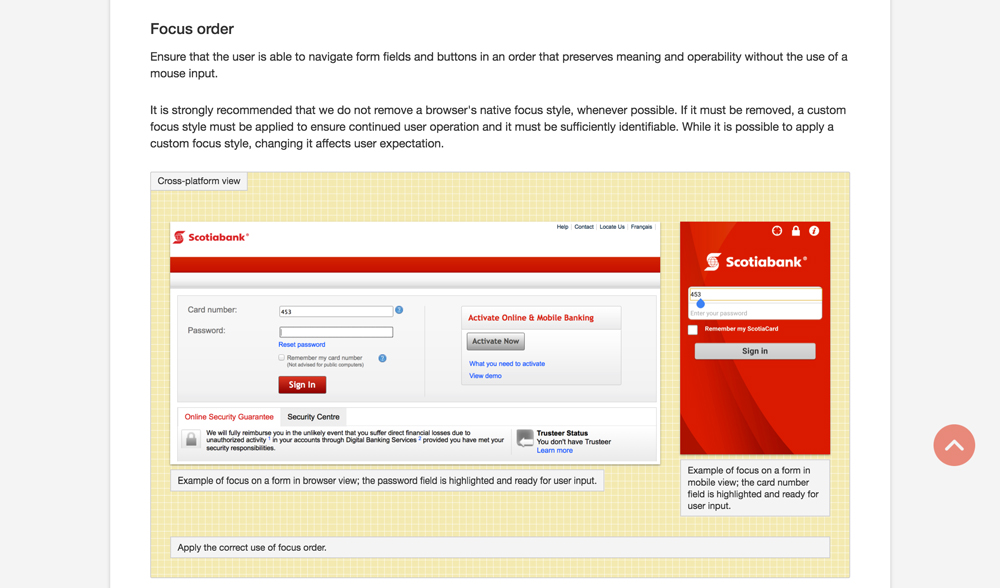
In an effort to unify different Scotiabank creative teams touching North American properties, we created the Scotiabank Digital Style Guide. The Style Guide contained specific experiential, architectural and visual rules written by both the User Interface and User Experience teams in a detailed and easy to follow way.

The Problem
- Scotiabank’s digital products did not follow a uniform ruleset for how they were presented both visually and from an interaction perspective.
- This created a disjointed experience for the customer when switching between applications.
Details
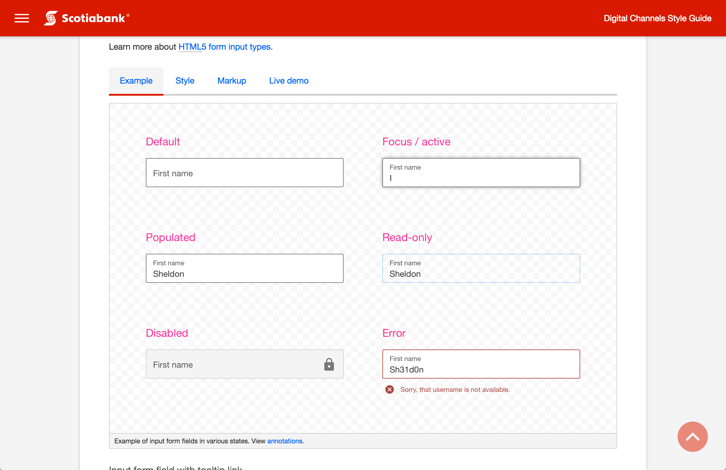
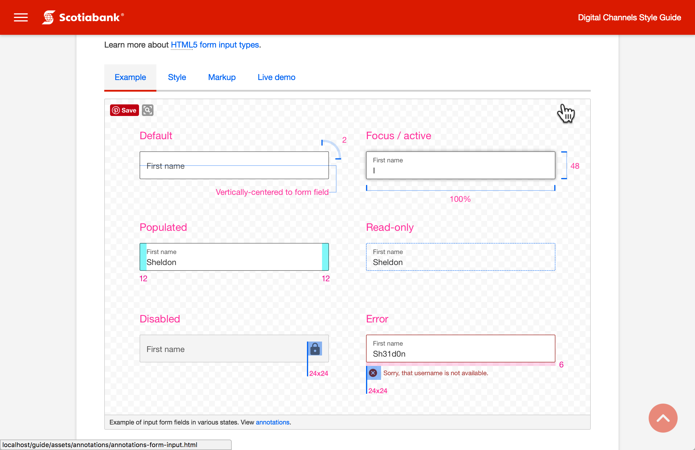
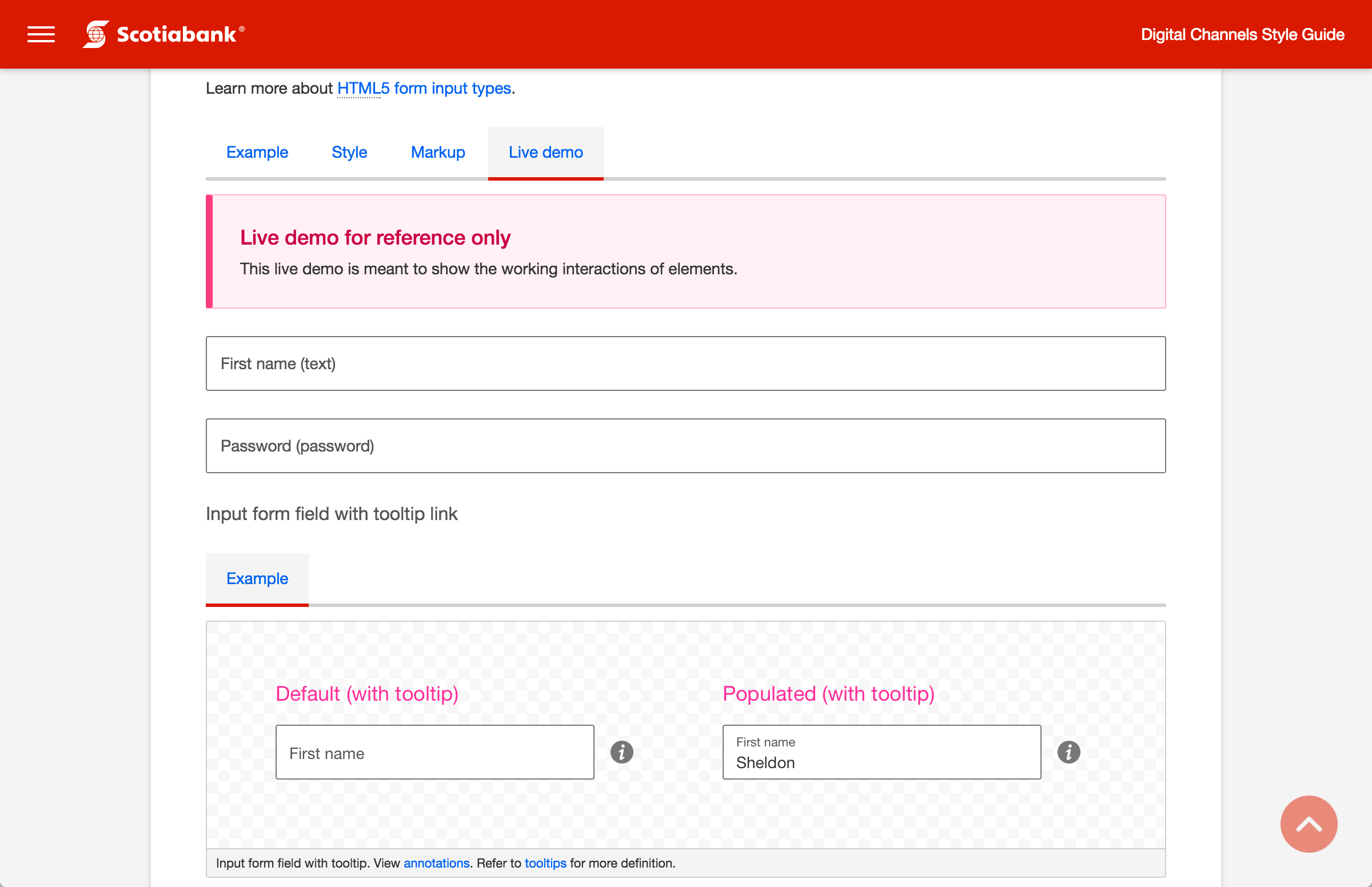
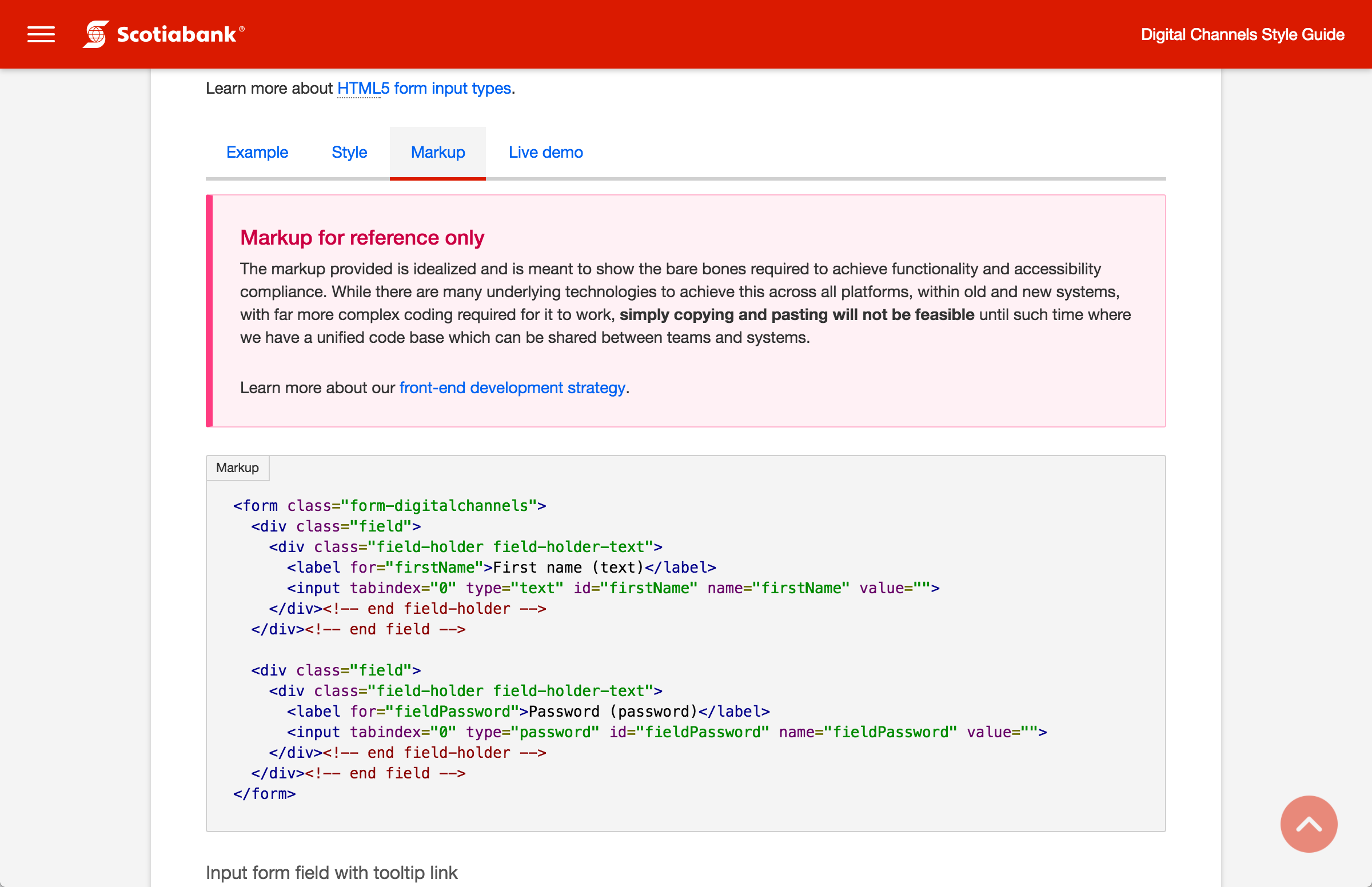
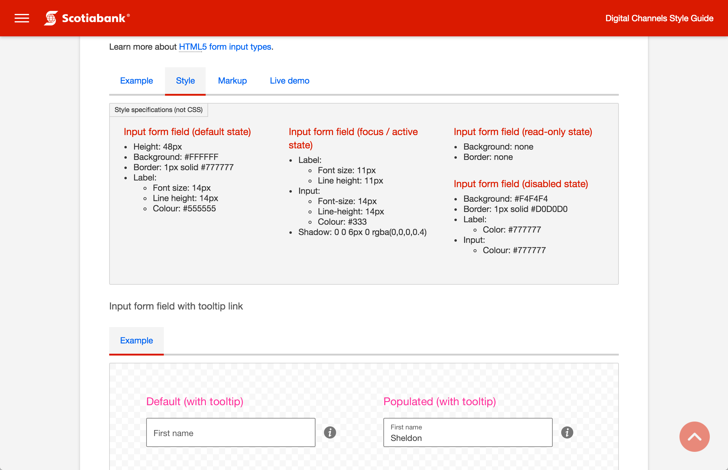

Visual Rules
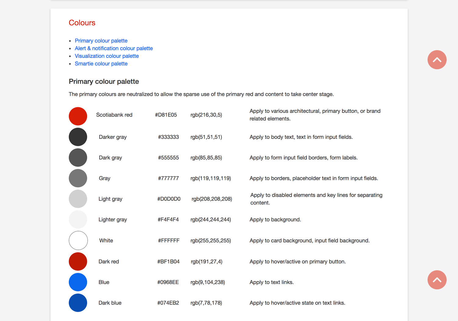
Color palettes, where and when certain colors are appropriate.

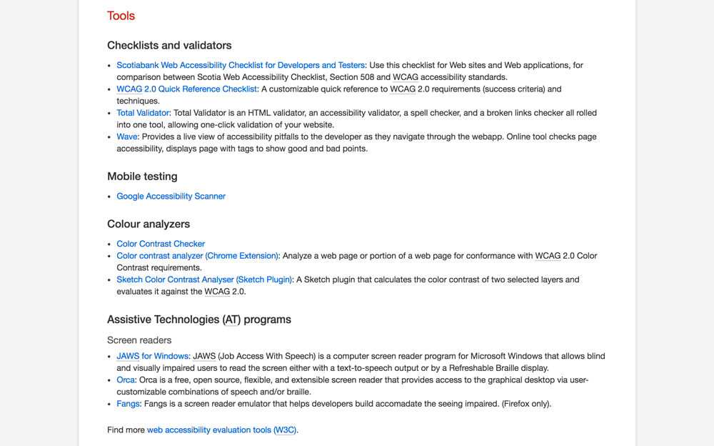
Accessibility
WCAG 2.0 Guidelines within the context of Scotiabank’s Digital Products
