Scotiabank Investment Onboarding
Role: Design Lead
We were tasked with coming up with a north star concept to entice customers; who did not feel like investing was for them, to start investing with Scotiabank. This meant coming up with a new experience that was both non-invasive, but compelling at the same time.
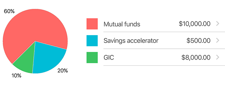
The Problem
- Prior research had suggested that customers were “intimidated” by the idea of investing.
- Even long-term customers who were familiar with other banking products did not consider investing “for them”, but were intrigued by the idea.
Research
- The first step we took was to conduct user interviews with customers who did not have investment products.
- Research from both the investment and our design team indicated that many of these customers felt like investment products did not apply to their lifestyle for a number of reasons.
- Some of the reasons included: Financial literacy, Debt or lack of funds, Product naming & intimidation, Uncertainty in market and Distrust of big banks just to name a few.

Competitive Analysis
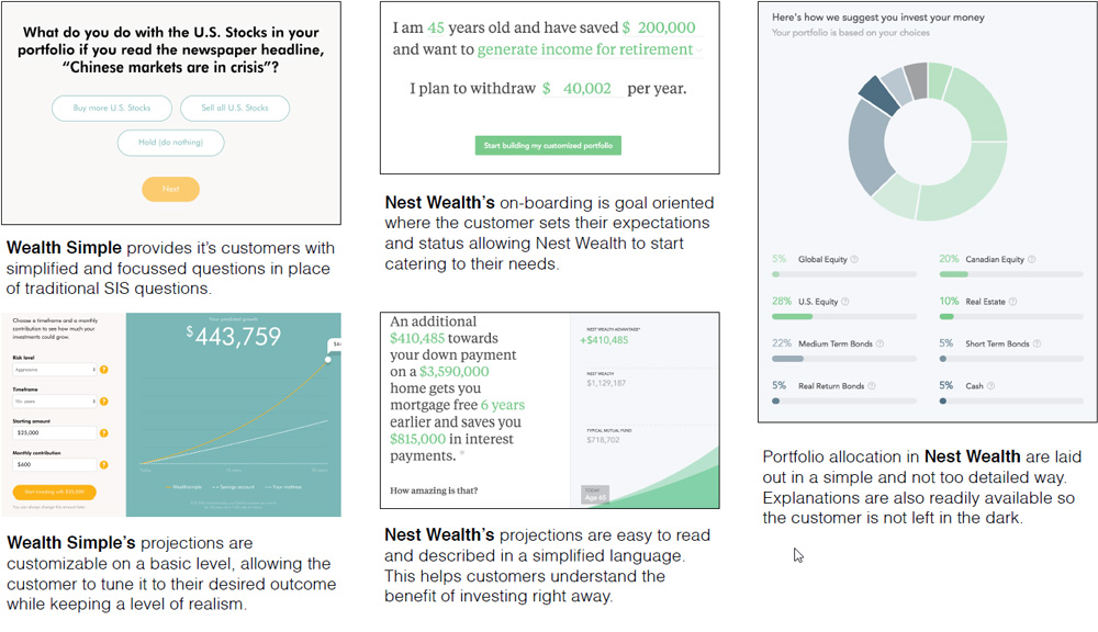
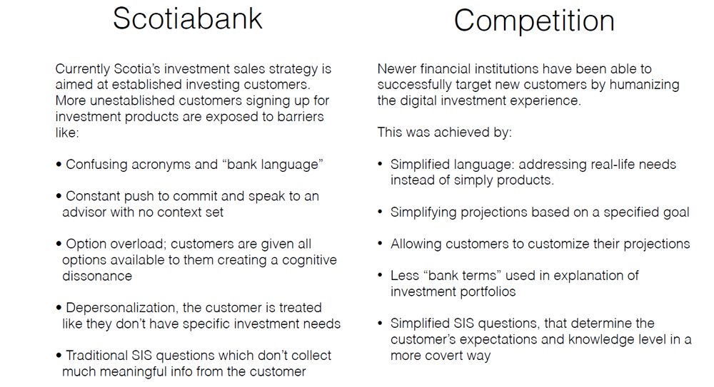
- Since we were aware that other financial startups were trying to tackle this space, we decided to do a competitive analysis to see what they were doing to mitigate some of these blockers.
- We looked at offerings from applications like Wealth Simple and Betterment.
Concepting
- Working closely with both customers and the investment team, we came up with a concept based off of both the user interviews and competitive analysis.
- The concept was meant to easy customers into the investment onboarding flow with a series of events within the app.
The strategy is split into 3 key sections: Hook questions, On-boarding questions, and Tuning.
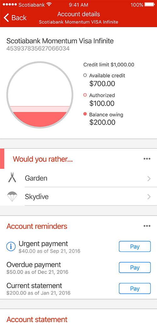
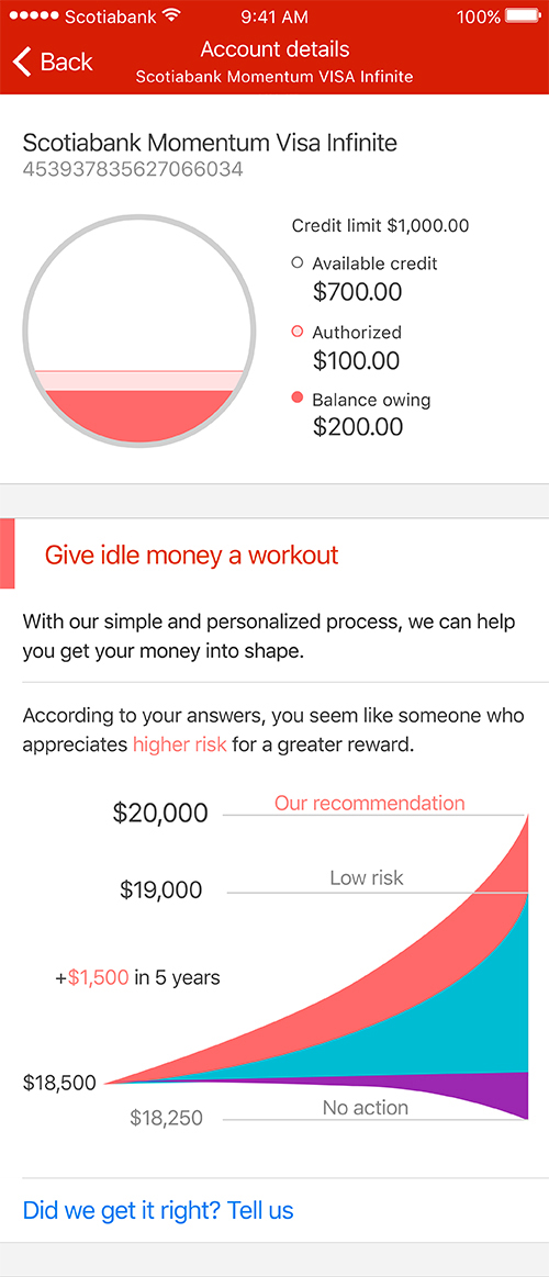
Hook – Gains user attention through fun, sometimes tongue-in-cheek, questions sprinkled through the experience to get a soft idea of the user’s mindset as it may pertain to investing. Hook questions never mention “investments” to mitigate our target audience glossing over it.
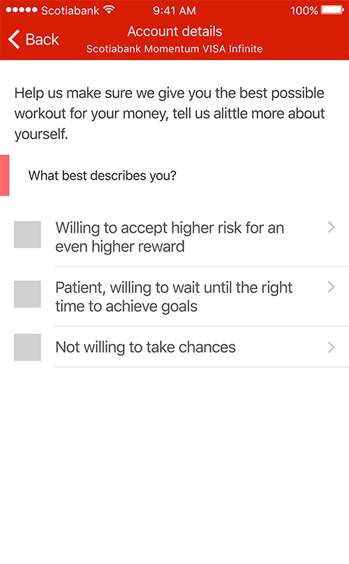
On-boarding – Asks more in-depth questions, as well as more humanized versions of the SIS questions to gather risk tolerance. This is used to create a clear picture of what type of products the customer should enroll for and why the recommendation is made.
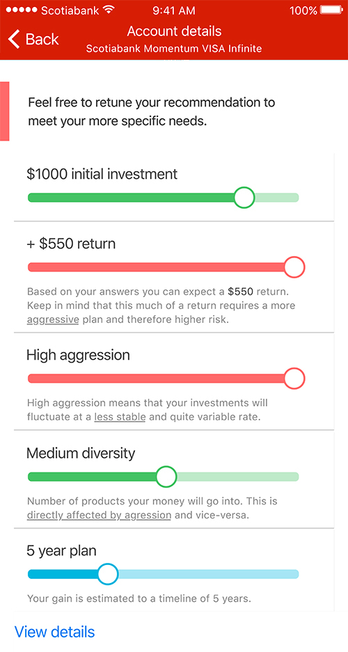
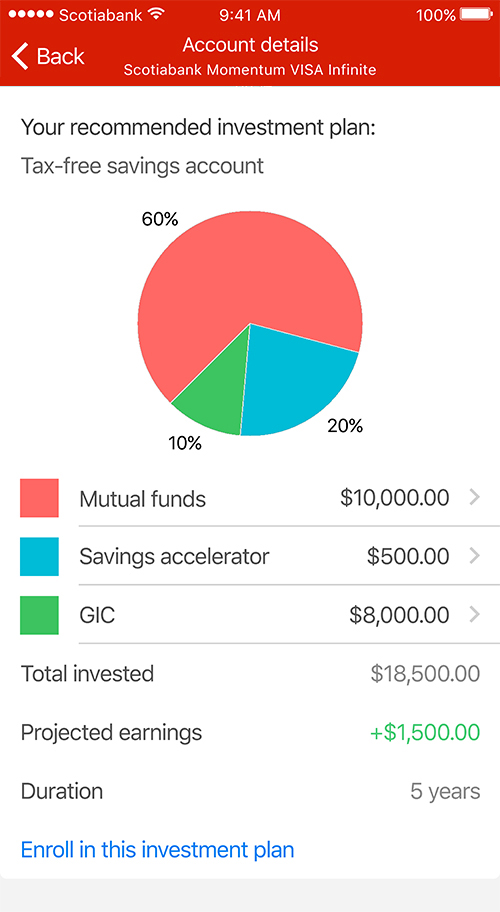
Tuning – Once a recommendation is made, we give control back to the customer by allowing them to fine-tune their recommendations to better meet their needs. Customers loved the idea of being able to play around with different scenarios.
User Testing
In order to validate these designs, we created a prototype for internal testing. The results for these tests were compiled and compiled into each part of the flow. These were the results:
Hook – The majority of test customers met the hook questions with curiosity and some confusion. This prompted them to interact with the questions as predicted. Some of the test subjects voiced concerns over the hook questions not applying to their lifestyle, for example questions that include having a car.
Graph – The initial hook graph seemed to be well understood and garnered interest, but lacked interactivity testers expected.
On-boarding – The majority of testers understood the questions were related to a result, but would have liked to know how many questions they would have to answer. Another sentiment we found was that some testers would have liked to “pass” on some questions.
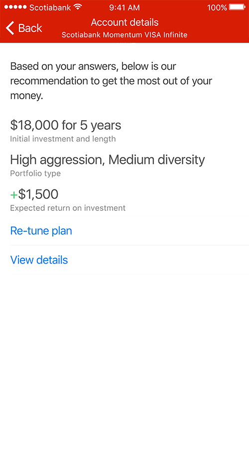
Recommendation and Tuning – While most users understood the recommendation, tuning was unanimously praised. While testers thought that “Re-tune” meant go back to the on-boarding questions, they were pleasantly surprised that they were able to readjust their preferences on the fly.
Final recommendation – The detailed breakdown of the recommendation was understood by the majority of testers. Although, testers felt the need to interact with the graph.
Conclusion
With quite positive results from user testing, the overall flow was seemed to be very effective. Most negative feedback stemmed from easy to fix experience oversights such as adding a progress tracker in the flow. The concept ended up being used as a north star for Scotiabank investment products in the future.